Monday, 29 April 2013

Visual Comm Week 2 - Textures & Principles of Designs

The second lesson of Visual Communication was not filled with drawing activities like the first one. We spent more time learning about the Principles of Design and textures. We then moved on to design and draw our own textures.
Each of us were required to draw 3 different textures:
1. A texture that represents ourselves
2. A texture from the surroundings
3. A texture based on our perception of the future


Texture 1

I drew moons as a texture that represents me because of several reasons. Firstly, I have a predilection for the stars, our moon and other astronomical objects.I have always found them beautiful and amazing as their presence are always intertwined with many endless possibilities because there are many facts about them and there are more to come. Most of the time, discoveries made about the universe are beyond the realms of our minds. I chose the moon as is one of the astronomical objects closest to us. Beyond the moon,and beyond the solar system, there are more astronomical objects waiting to be discovered. I aspire to achieve, and I believe that every human being was created to break barriers and soar towards excellence. I see the moon as the first aim in my life, and I want to beyond it and achieve more, as there are many areas in life waiting to be unleashed.
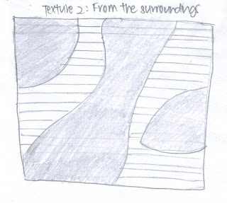
Texture 2

I chose to draw the designs on the carpeted floor for the second texture.

Texture 3
Lastly, we had to draw a texture that represents the our perception of the future. I drew buildings that increase in height significantly. With advancement in technology, we will be equipped with more knowledge and skills. Hence, standards and expectations in most areas in life, in terms of work and academics, will escalate rapidly. The number of units in the buildings also increases. This is to represent the increased competition as everyone aims to outshine each other.


The second activity we did was to create a short presentation about the examples of Principles of Designs which we learnt. Through the short presentations made in small groups, I got a better understanding of the concept as we had to look for the examples ourselves. I can now identify the Pinciples of Designs in photos and magazine pages.

The last activity of the day was to sketch the Red Bridge, taking into consideration our perspectives and points of view. After about two hours, I finally completed the sketch as shown below.
My sketch of the red bridge

      
The red bridge


During this lesson, I have not only learnt how to identify the various designs according to the principles, but also on how to improve our drawings. After learning about perspectives, I realise how much it helps to include perspectives in our sketches. It makes our drawings look more realistic. Apart from that, I also understand the difference between actual textures and visual textures. Before today, I thought that textures only refer to surface illusions of things like water, wood, fabrics and metals. The activities we did were of great help as it aids my learning and improved my understanding of the theories.

Sunday, 21 April 2013

Visual Communication – Week 1 (19 April 2013)

During our first lesson of Visual Communication, we were taught about shapes, lines, and proportions. Mr Victor guided us through the session. Initially, some of us were worried as we do not possess artistic skills. When Mr Victor flashed us a picture of Heffalump and Kungfu Panda and announced that we would be tasked to draw the two cartoon characters, I was quite taken aback as I am one of those who is not artistically-inclined. However, I tried my best to keep up with the lesson and draw the images systematically.
 
We were taught to identify the basic geometrical shapes present in the pictures and sketch them out. We then added the details and refined our drawings using the shapes as a guide. It was a useful method as we could gauge the angles of our pictures. It took me three attempts to outline the image of the panda as it was difficult for me to gauge the proportion at first. After about 20 minutes of work, most of us completed our drawings of Kungfu Panda and Heffalump. It was a tough start, but we learnt a useful tool which is to use basic geometrical shapes as a guide for our drawing.

My first attempt to draw the image of the Kungfu Panda
on the left by using the basic shapes as a guide. 

The original picture of Kungfu Panda 
Heffalum was drawn using basic shapes as a guide as well.
             
The original picture of Heffalum


Fortunately, the second task was easier than the first. I chose to draw the figure in the middle. Putting the skills taught before into consideration, I managed to complete the drawing within a shorter time. However, Mr Victor commented that the image I drew was not proportionate and it was different from the original picture. I edited my drawing and the results of my work can be seen below.  


An image of the figure in the middle
Original picture of the figurines


We then moved on to learn about lines. This time round, it was a paired activity. We had to sign on an A4-sized paper, exchange our signatures with our partners an attempt to copy the drawing with the original picture being inverted. As we progressed, I noticed that I became more aware and put the spaces and thickness of the lines into consideration to copy the signature as accurately as possible.
Yan Feng's original signature.                                               My copy of Yan Feng's signature.


The fourth task was one of the toughest. Looking at a picture of a rose that was held upside-down, we had to copy the image of the rose from bottom to top. We spent the most time on this task, but it was a fruitful attempt as I was satisfied with the results.


The original picture of the rose.
Final image of rose drawn by me.


After getting the proportions of the drawings wrong several times, we finally learnt how to gauge the proportions of the images using the ‘Pencil & Thumb’ method.  It was a very useful method, as I finally learnt to divide the page and make fewer mistakes in proportion while drawing the image. The outline of the dog below was completed at home due to time constraint in school.


An outline of the image of the dog on
the left.
Original picture of the dog.


Finally, we approached the last task which was a very fun one. We had to draw an outline of our partner’s bodies, bearing in mind that we have to utilise all the methods taught. I am actually grateful to Yan Feng for posing simply so that I would have an easier time trying to draw an outline of his body.

Yan Feng posing for the picture.
An outline of Yan Feng's body.


Besides learning about the methods mentioned above, we also learnt about negative space. It is a way of creating an image by not using definite lines. This method is used by organisations and advertising companies to create a unique image of their own. During the 4 hours, we learnt to draw using the methods taught. Although it was tough at first, the methods taught were useful in helping us improve on our drawings. It took a great deal of perseverance to complete each of the drawing, but our hard work paid off and it was evident in the improvement seen on our subsequent drawings.