Logos
Typography plays an important role in logos, especially when the type of logo used is logotypes.
 |
| Logo of Megaflicks |
Photo credits: http://www.logotod.com/blog/10-examples-when-logo-design-goes-wrong/
The picture above is a logo of a brand named "Megaflicks". However, since the character spacing is too close, the word reads a different name that has a different meaning. While searching for this image on Google, there were several different different edits that were done on this picture. One had a caption which said that it should change its font. However, I do not agree with this view. They can still have the same font but adjust the character spacing, and the logo would not be misread.
The logo above is for a brand named Kids Exchanged. People have misread it as Kid-Sex-Change instead of its original name. This is because the characters are capitalised throughout and the space between "kids" and "exchange" are very close.
Magazine articles
This article has a consistent font between its title and the writeup. However, I feel that Simon Cowell's name and the heading of the article are too contrasting. In terms of weight, I feel that the font used for the heading might be a little heavy as compared to his name. Although both are bold, I feel that it be better if the font for the headline is not too heavy. However, the font of the content of the article is similar to its heading, hence being consistent. Nevertheless, consistency is not only determined by using the same font, but also how well a font matches with another.
Print advertisments/posters:
Photo credits: http://media.smashingmagazine.com/images/poster-advertisement-tutorials/54.jpg
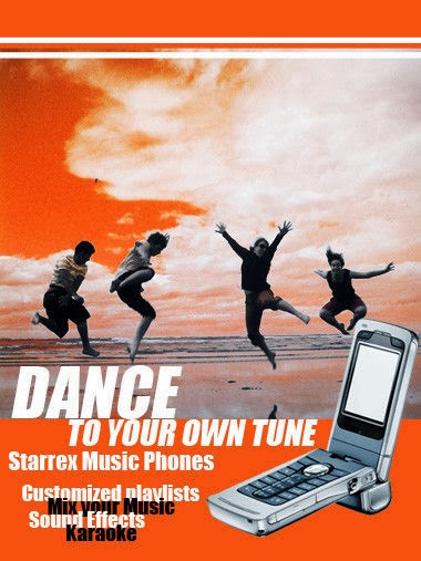
This advertisement above has exemplified a bad use of typography. Apart from the word "dance, I feel that heavy fonts should not be in italics in a small size. It does not look elegant or nice. The spacing between the words "customized playlists", "Mix your Music", "Sound Effects" and "Karaoke" too close. The line height should be increased as it is difficult to read although the effect was intentional.
I cannot tell the key message of this poster as the main word is "dance". I would have thought that this was a poster to promote dance classes instead of one which advertises a phone., if not for the picture of the handphone.To improve this, the words "Starrex Music Phones" should be the highlight. They can also use a different font which is not too contrasting so that it is easier for readers to tell apart the specifications of the phone apart from the heading.
The exposure to mistakes in typography and how it affects readers' or clients' attention has made me realise its importance. I will use this knowledge to work on the typography of my CA2 assignment to ensure that I do not make any mistakes like the examples above.
Photo credits: http://www.businessinsider.com/15-worst-corporate-logo-fails-2012-1?op=1
Magazine articles
Photo credits: http://thenamesbeautifulmissbeautiful.blogspot.sg/p/newspaper-and-magazine-articles_16.html
Print advertisments/posters:
Photo credits: http://media.smashingmagazine.com/images/poster-advertisement-tutorials/54.jpg
This advertisement above has exemplified a bad use of typography. Apart from the word "dance, I feel that heavy fonts should not be in italics in a small size. It does not look elegant or nice. The spacing between the words "customized playlists", "Mix your Music", "Sound Effects" and "Karaoke" too close. The line height should be increased as it is difficult to read although the effect was intentional.
I cannot tell the key message of this poster as the main word is "dance". I would have thought that this was a poster to promote dance classes instead of one which advertises a phone., if not for the picture of the handphone.To improve this, the words "Starrex Music Phones" should be the highlight. They can also use a different font which is not too contrasting so that it is easier for readers to tell apart the specifications of the phone apart from the heading.
The exposure to mistakes in typography and how it affects readers' or clients' attention has made me realise its importance. I will use this knowledge to work on the typography of my CA2 assignment to ensure that I do not make any mistakes like the examples above.


