Wednesday, 15 January 2014

SPOH Spyration

As we move on to the new year, schools all over Singapore are busy with open houses. During this busy week, we were assigned to observe the open houses in the different polytechnics. I was assigned Singapore Polytechnic. There were more pictures that I did not manage to take as I was on duty at the goodie bags booth for the open house on all three days.
One of the goodie bags given to the visitors.


Contents of the goodie bags. Some goodie bags also included Teenage Magazine and notebooks which are not seen in the picture.

A watch that was in the goodie bag.

The goodie bags booth

Wallpapers like this were placed all over SP.

Backdrop of the stage. There was a crowd so I could not take a full photo.

One of the many signages all around the campus.


Banner that can be seen from the MRT station.


     What is the theme and the message?
T   The theme of the Open House, "SP+U" with its tagline "With SP, it's So Possible" carries the message which states that SP has a very inclusive environment and wishes to let students explore their potentials and work towards success. All over SP, the colours used are mainly white and red, with many volunteers dressed in yellow. The colour theme gave me the impression that SP has a fun yet conducive study environment.


     Is it effective? What makes it effect? What worked? Why?
        I feel that it was effective because the consistent colour themes created a strong image and identity of the school. This helped created an impression on the visitors. Although some may find the colours boring, it still fit the purpose of and aim of the open house - which is to create an impression for them to come back.
  
    Do you like it? Why/Why not?
       Personally, I would prefer a  more colourful environment to make the add more fun to the atmosphere. However, I feel that the event and designs had a very strong theme. It may look boring, but the consistency in the designs such as the colour and fonts (although not much variations) created a strong impression on the school. It strengthens the identity of SP as the same colours are seen throughout the whole campus.

·       What could be done to improve it? Can you suggest improvements to it?
   I noticed that there were not many CCA booths. As compared to last year's open house, the CCA booths were not many. Having many CCA booths with fun activities would help engage students and capture their interest. As they are mostly fresh from secondary schools, they would be enticed by the wide choices of CCAs offered in SP. We should utilise the availability of many CCAs to promote and capture visitors' interests.
·       If any part of the physical items reinforce another medium like Video, Radio or Social Media, please elaborate.

      On social media such as Instagram and Twitter, the hashtags #SPOH14 and #WhySP were widely used to promote SP and draw people to come to our school for the open house. It was an expected move but it was only right to benefit from this and utilise the social media to promote the school.

·       Was there anything in particular that was innovative and really caught your attention and impressed you?
T     I felt that the open house was a normal one. However, it was not boring. I would like to highlight the distribution of helium balloons as it drew the attention of many. There was a balloon booth where visitors could collect transparent helium balloons and write on their own balloons. Many people came over and asked where they could get the balloons. 

    The open house seemed boring at first because of the consistency in the colours. It was all red, blue or purple on white background all over. However, after analysing the designs, I realise that the consistency played a major role in building a strong identity of the school, which played a major role in creating an impression. In conclusion, I would like SP to continue with this theme as it is our identity.

Saturday, 30 November 2013

Fundamentals of Web Design: Introduction to Dreamweaver

This week, we learnt how to use dreamweaver to link a page to another. It was a tough lesson but we pulled through because we were determined to get a takeaway from this lesson as it is the fundamentals of web design. If we do not understand this lesson, the tutorials ahead will be difficult for us.

Before going to dreamweaver, we learnt to slice the pages on Photoshop. I encountered difficulties initially because I did not change the names of the files after slicing the pages. The files did not work if it had duplications. After about one to two hours of work, I finally managed to complete the task.
Slicing the pages on Photoshop

The home page of Halia at SBG
After clicking the Private Events page

After clicking the Weddings page
After clicking the catering page
After clicking the menu page

It was tough at first but after numerous attempts to master the skills through the first page, which is the Private Events page, the rest of the pages became easy as we simply had to repeat the routine. Despite it being the first lesson through the fundamentals of web design, it is a tough task for me. I will have to polish my skills and keep practising so that I do not forget how to do this.


Sunday, 3 November 2013

Visit to Peranakan Museum

Our trip to the Peranakan Museum made me appreciate the differences in culture among the human race. Apart from traditions and religious practices, the designs on their daily items reflected their unique quality as a culture itself. The main takeaway from this trip was the visuals we saw on the ornaments and costumes displayed.
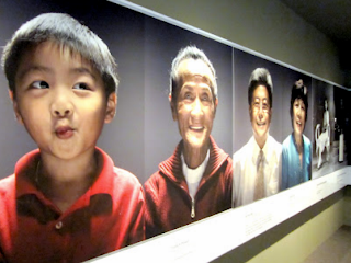
1.1 A large collage of photos at the first level featuring different Peranakan people of different generations.
Prior to this trip, I thought that the only Peranakans who existed were Peranakan Chinese. I realised that I was wrong as there are 3 different types of Peranakans: Peranakan Chinese, Jawi Peranakans, and Chitty Melaka Community.Peranakans. Jawi Peranakans are descendants of intermarried couples between South Indian-Muslim traders and woman of the local malay communities. The Jawi Peranakans had an entrepreneurial and forward-looking spirit. They were viewed as elite socio-economic group and excelled in the fields of business and education. Chitty Melaka Community, also known as the Straits-born Hindus or Indian Peranakans are descendants of intermarried couples in Malacca. They strongly resemble the Malays and Baba Nyonyas in terms of clothing, food and appearances. They maintain their hindu names and customs.
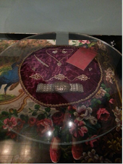
1.2 A bridal headdress that Singapore or Malacca Peranakan brides wear. 

This headdress that the brides wear consist of 174 hairpins in total, causing it to be as heavy as what it appears to be. The hairpins have the shape of flowers, insects, sea creatures, birds, and other symbols. These different shapes and creatures have very beautiful designs. Although it looks heavy, the headdress looks exquisite.
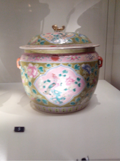
1.3 One of the Kamchengs displayed.
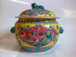
1.4 A Kamcheng


1.3 A Kamcheng is a type of covered container which is popular in the Peranakan Community. It is one of the most common forms of pottery made of porcelain. It is usually used to contain drinking water, food or desserts depending on the family.

If we look closely, apart from the intricate designs that usually take the form of curve lines, the kamchengs often have a lion-dog at the top of the lid. These porcelains are in-and-our porcelains, which means that they are decorated with coloured enamels on both the interior and exterior surfaces.

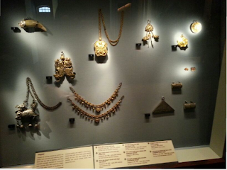
1.5 A display of the accessories worn by Peranakan women.
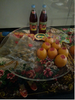
1.6 One of the gift trays given to the bride in a Peranakan wedding which contains food.
The Peranakan wedding gifts or dowry varies from food to accessories. There was another tray on display which consist of more food and a pig's leg.

1.7 Another wedding gift tray. This one consists of accessories.

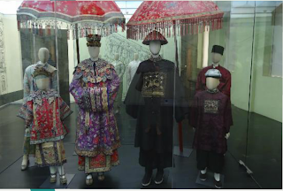
1.8 Mannequins portraying a Peranakan groom on his way to his wedding.
The Peranakan wedding is a grand affair. There were many other displays which I did not manage to take photos of as I did not bring my camera. They costumes had many intricate designs that were beautiful.
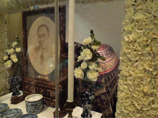
1.9 A display of a Peranakan funeral ceremony
From weddings to funerals, the museum surely equipped us with much knowledge in a 2-hour tour around the museum. The funeral display was almost a realistic one as there was audio playing at the background which featured a woman mourning the passing of her husband.

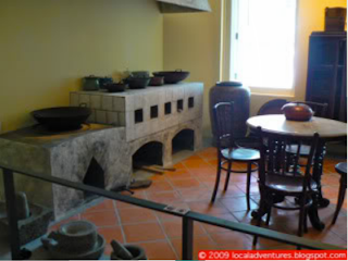
2.0The kitchen of a Peranakan house.
2.0 The kitchen displayed seemed like a normal kitchen portrayed in a typical Peranakan house as we have seen in shows like The Little Nyonya. What made me more interested was the fact that in the past, according to their culture, men were discouraged from entering the kitchen where women spent most of their time in. In this modern society, most women no longer spend much time in the kitchen cooking dishes for their family. However, in the past, the kitchen was what I deemed as their 'playground'. 


The Peranakan were known for their skills in embroidery and cooking. During this trip, I unintentionally focused more on their cultural practices and history as compared to the design aspects. However, I am still awed by the beauty of their embroidery and intricate designs on all their things - from costumes to furniture to pottery. Almost every item in the house have detailed, beautiful designs. 

Given a chance, I would love to attend a workshop on embroidery and learn about the history or story behind their designs. Although I thought the trip was going to be boring, it turned out to be fun as I spend most of the time admiring the displays and ornaments and equipped myself with knowledge about their culture.

Photo credits (kamcheng) : http://www.flickr.com/photos/kamcheng/3556703587/

Sunday, 20 October 2013

18/10/13: VC Sem 2 Week 1 - Creative Brief

VC Semester 2 Week 1: Constructing a Creative Brief


Last Friday, we had our first VC lesson after 6 weeks of vacation. It was difficult for us to concentrate as it was a Friday afternoon on the first week of school, where everyone is still trying to adjust ourselves to the new schedules after the long break. This week, we covered an overview of the lessons we were going to have weeks ahead, followed by our first lesson on how to construct a creative brief.

1. How things work in an advertising agency


Before being introduced to a creative brief, we were taught about the departments and work distribution in an advertising agency.
Fig. 1.1


Fig 1.1 above shows an outline of the people from the agency who are involved needed in a project when a client hires them. To sum up what I have learnt, I summarised their roles as listed below:

Strategy planner

The strategy planner is in charge of planning, as the name says it. They need to do a thorough research on focus groups or through interviews so as to come up with an effective advertising strategy. It is important to come up with an effective strategy so that a significant achievement based on the client's objectives is seen.in 

Account team

The account team is mainly responsible in liaising between the client and the agency. They are the main mediators between these two. They are also responsible for the pitching of the agency's proposed advertising campaign to the client. The account team will write the creative brief and hand it to the creative department. 

Creative department

The creative department will come up with advertising ideas based on the creative brief given by the account team. Once their ideas are approved, they will follow through the final execution.

Production department

As the name says it, the production department is in charge of producing the approved advertising idea. They work closely with the art director to ensure that the final product is the way they want it to be.


Apart from just theory, there was a role play by some of our classmates to aid us in picturing the working environment in an agency and between the client and the agency.

2. Constructing the Creative Brief

The creative brief is designed so that the agency will get a clearer idea of the brand's background. It contains the background information about the client's brand, the key issue, a contract, a checklist, and a conclusion. The creative brief also contains a profile of the brand's target audience. These things included in the creative brief serve to ensure that the advertising campaign proposed by the agency will suit the needs and objectives of the client as much as possible. Apart from the content of the brief, the tone of voice used in the brief must also be appropriate.

After learning about the theory of constructing a creative brief, we tried to list the contents of a creative brief, our client being One Rochester. Initially, we did not understand how to do the assignment. However, with the guide of a sample creative brief, we managed to complete it. The purpose of that activity was to let us experience and understand the contents of a creative brief better. 


After blogging about the lesson, I actually understand it better. I realise that advertising campaigns take a lot of effort from different people in the agency. The client also has to cooperate actively in order to make the campaign successful. A huge number of manpower is required. If the client refuses to cooperate and leaves most of the workload to the agency, many glitches will be present as the agency might not be able to fulfil their objectives. In order to prevent this, the client has to provide a thorough client brief and state their requirements clearly. The account team also has to ask more questions and get as many information as possible that will guide them to come up with an advertising campaign that best suits the client.

Although I was not interested in working in an advertising agency before this, I realise that I would not mind working under the account department in future. This is because the pitching of ideas suits what I like to do. However, liaising between two parties is a huge responsibility. It is one of the most important roles as the client's message that is delivered to the agency and vice-versa will have a direct impact on the final results.

After today's this week's tutorial, I am more open to include working under the account department in an advertising agency in the future.

Saturday, 3 August 2013

Semester 1 Week 16: Basic Typography

Today, we learnt about basic typography. Prior to this lesson, I did not know that it was possible to tweak fonts according to our liking. I have always thought that the most appropriate fonts are already in the basic collection on the computer. Using the knowledge I got from this lesson, I would like to talk about some designs online which I like and some that I do not.


Logos 

Typography plays an important role in logos, especially when the type of logo used is logotypes.
Logo of Megaflicks
Photo credits:  http://www.logotod.com/blog/10-examples-when-logo-design-goes-wrong/

The picture above is a logo of a brand named "Megaflicks". However, since the character spacing is too close, the word reads a different name that has a different meaning. While searching for this image on Google, there were several different different edits that were done on this picture. One had a caption which said that it should change its font. However, I do not agree with this view. They can still have the same font but adjust the character spacing, and the logo would not be misread.


Photo credits: http://www.businessinsider.com/15-worst-corporate-logo-fails-2012-1?op=1

The logo above is for a brand named Kids Exchanged. People have misread it as Kid-Sex-Change instead of its original name. This is because the characters are capitalised throughout and the space between "kids" and "exchange" are very close.


Magazine articles
Photo credits: http://thenamesbeautifulmissbeautiful.blogspot.sg/p/newspaper-and-magazine-articles_16.html

This article has a consistent font between its title and the writeup. However, I feel that Simon Cowell's name and the heading of the article are too contrasting. In terms of weight, I feel that the font used for the heading might be a little heavy as compared to his name. Although both are bold, I feel that it be better if the font for the headline is not too heavy. However, the font of the content of the article is similar to its heading, hence being consistent. Nevertheless, consistency is not only determined by using the same font, but also how well a font matches with another.

Print advertisments/posters:
Photo credits: http://media.smashingmagazine.com/images/poster-advertisement-tutorials/54.jpg

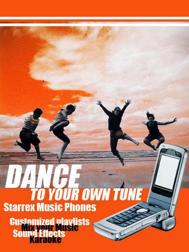
This advertisement above has exemplified a bad use of typography. Apart from the word "dance, I feel that heavy fonts should not be in italics in a small size. It does not look elegant or nice. The spacing between the words "customized playlists", "Mix your Music", "Sound Effects" and "Karaoke" too close. The line height should be increased as it is difficult to read although the effect was intentional.
I cannot tell the key message of this poster as the main word is "dance". I would have thought that this was a poster to promote dance classes instead of one which advertises a phone., if not for the picture of the handphone.To improve this, the words "Starrex Music Phones" should be the highlight. They can also use a different font which is not too contrasting so that it is easier for readers to tell apart the specifications of the phone apart from the heading.


The exposure to mistakes in typography and how it affects readers' or clients' attention has made me realise its importance. I will use this knowledge to work on the typography of my CA2 assignment to ensure that I do not make any mistakes like the examples above.


Sunday, 28 July 2013

Sem 1 Week 13: Introduction to Adobe Indesign

This week, we learnt how to use Adobe Indesign. It was an important lesson because we need to learn how to use this software well before we start on our CA2 which is to design a brochure. The tools are similar to Adobe Illustrator, just that it is more convenient for me to write words.

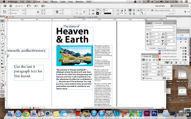
Before using the software, we edited an image on Photoshop first. Below is the result of our first activity. It was supposed to be "Heaven & Earth", but we were free to play around with the tools hence I typed my name instead.


We then proceeded to execute our first brochure, in which the content is ready for us to use. 


The last picture above is the final product of our brochure. The blue lines are the guides for me to check the grids and alignments of the brochure. It can be made invisible and will not appear after printing.

This week's lesson was tough at first because of the editing of the photo. We edited the image on photoshop before opening it in Indesign. However, I could really feel the sense of achievement after completing the brochure at the end of the day although we only followed through the lesson.

The tutorial made me consider a few things to be kept in mind while doing my CA2. I would need to ensure that the font is appropriate, followed by the spacing of the fonts. Lastly, I need to ensure that I deselect the hyphenate bar. I prefer my texts to be non-hyphenated as it will be easier to read.

However, this activity made me realise that it is alright if my brochure is simple, as long as it is neat and the key message of the brochure is brought across. As long as the brochure design is simple and appropriate, it will be fine. This leads me to decide on a simple and neat corporate brochure, instead of one with fancy designs.

Sunday, 21 July 2013

19/07/13: Visual Communication Week 14

This week we were taught to design a brochure. After doing some consultations for our CA assignments, we learned about effective brochure designs that will appeal to clients. Then, we learnt how to use several tools on InDesign software and created a travel brochure using the software mentioned.

1. Effective brochure designs

During the first part of our lesson, we learnt that there are 8 elements of an effective brochure design as stated below.


  • Meets clients' needs
  • Meets branding guidelines
  • Has your "valuable input"
  • Has an attention-grabbing cover using visuals or header
  • Has strong images and graphics
  • Clear and compelling content
  • Unique selling point (UOP)
  • Call to action
For our upcoming CA, I believe that it would be wise to concentrate on the design aspects such as having an attention-grabbing cover and having strong images and graphics. This is because we will be assessed through our design skills and the contents of the brochure have already been given.

The degree as to how presentable and nice a brochure is is subjective. However, there are certain guidelines which ensures that a corporate brochure is within acceptable range in terms of how it looks. For example, I think it is important to keep the brochure design simple and professional. To achieve this, the main theme of the brochure is important as it will influence the colour theme, fonts and pictures used.

An example of a corporate brochure

The image above is an example of my personal favourite corporate brochure. It has a neat and defined layout. The colours red, white and black are the main colour theme, making it look professional. The content does not seem to chunky or wordy as they are separated into smaller paragraphs with pictures in between. This appeals to readers more as it does not look boring. However, I do not like red page where the font is white. This is because there is too much contrast and it might be difficult for readers to read.

The 8 elements shared drove me to consider the theme of my brochure carefully. Now, I am certain that I would like to keep my brochure design simple and neat. Although keeping a design to be simple and neat may sound easy, it is actually difficult as I need to think of a way to make it outstanding despite it being simple. This week's tutorial sure helped me a lot!

2. Designing a travel brochure


I had some difficulties using this software along the way as it was our first time doing a whole brochure on this software. Today, we learnt how to import images to our brochure and to import a newly-added font. Initially, I had some difficulties importing the images at first because I could not fit the entire picture into the frame, hence half of the picture was gone. In the end, I realise there were two separate borders and guidelines for me to follow and that I could click to resize the picture to fit it in the frame. 

This week's lesson was not content-heavy but I learnt a lot while going through the activity for the InDesign software. I realise that there are more things learnt and I got to jot down notes lest I forget what was thought! Initially, I did not jot down notes as I believed whatever has been practiced will not be forgotten. However, Ms Li Sar suggested that we take down notes and I realise how much it meant afterwards when I went home to try the software again!