Sunday, 20 October 2013

18/10/13: VC Sem 2 Week 1 - Creative Brief

VC Semester 2 Week 1: Constructing a Creative Brief


Last Friday, we had our first VC lesson after 6 weeks of vacation. It was difficult for us to concentrate as it was a Friday afternoon on the first week of school, where everyone is still trying to adjust ourselves to the new schedules after the long break. This week, we covered an overview of the lessons we were going to have weeks ahead, followed by our first lesson on how to construct a creative brief.

1. How things work in an advertising agency


Before being introduced to a creative brief, we were taught about the departments and work distribution in an advertising agency.
Fig. 1.1


Fig 1.1 above shows an outline of the people from the agency who are involved needed in a project when a client hires them. To sum up what I have learnt, I summarised their roles as listed below:

Strategy planner

The strategy planner is in charge of planning, as the name says it. They need to do a thorough research on focus groups or through interviews so as to come up with an effective advertising strategy. It is important to come up with an effective strategy so that a significant achievement based on the client's objectives is seen.in 

Account team

The account team is mainly responsible in liaising between the client and the agency. They are the main mediators between these two. They are also responsible for the pitching of the agency's proposed advertising campaign to the client. The account team will write the creative brief and hand it to the creative department. 

Creative department

The creative department will come up with advertising ideas based on the creative brief given by the account team. Once their ideas are approved, they will follow through the final execution.

Production department

As the name says it, the production department is in charge of producing the approved advertising idea. They work closely with the art director to ensure that the final product is the way they want it to be.


Apart from just theory, there was a role play by some of our classmates to aid us in picturing the working environment in an agency and between the client and the agency.

2. Constructing the Creative Brief

The creative brief is designed so that the agency will get a clearer idea of the brand's background. It contains the background information about the client's brand, the key issue, a contract, a checklist, and a conclusion. The creative brief also contains a profile of the brand's target audience. These things included in the creative brief serve to ensure that the advertising campaign proposed by the agency will suit the needs and objectives of the client as much as possible. Apart from the content of the brief, the tone of voice used in the brief must also be appropriate.

After learning about the theory of constructing a creative brief, we tried to list the contents of a creative brief, our client being One Rochester. Initially, we did not understand how to do the assignment. However, with the guide of a sample creative brief, we managed to complete it. The purpose of that activity was to let us experience and understand the contents of a creative brief better. 


After blogging about the lesson, I actually understand it better. I realise that advertising campaigns take a lot of effort from different people in the agency. The client also has to cooperate actively in order to make the campaign successful. A huge number of manpower is required. If the client refuses to cooperate and leaves most of the workload to the agency, many glitches will be present as the agency might not be able to fulfil their objectives. In order to prevent this, the client has to provide a thorough client brief and state their requirements clearly. The account team also has to ask more questions and get as many information as possible that will guide them to come up with an advertising campaign that best suits the client.

Although I was not interested in working in an advertising agency before this, I realise that I would not mind working under the account department in future. This is because the pitching of ideas suits what I like to do. However, liaising between two parties is a huge responsibility. It is one of the most important roles as the client's message that is delivered to the agency and vice-versa will have a direct impact on the final results.

After today's this week's tutorial, I am more open to include working under the account department in an advertising agency in the future.

Saturday, 3 August 2013

Semester 1 Week 16: Basic Typography

Today, we learnt about basic typography. Prior to this lesson, I did not know that it was possible to tweak fonts according to our liking. I have always thought that the most appropriate fonts are already in the basic collection on the computer. Using the knowledge I got from this lesson, I would like to talk about some designs online which I like and some that I do not.


Logos 

Typography plays an important role in logos, especially when the type of logo used is logotypes.
Logo of Megaflicks
Photo credits:  http://www.logotod.com/blog/10-examples-when-logo-design-goes-wrong/

The picture above is a logo of a brand named "Megaflicks". However, since the character spacing is too close, the word reads a different name that has a different meaning. While searching for this image on Google, there were several different different edits that were done on this picture. One had a caption which said that it should change its font. However, I do not agree with this view. They can still have the same font but adjust the character spacing, and the logo would not be misread.


Photo credits: http://www.businessinsider.com/15-worst-corporate-logo-fails-2012-1?op=1

The logo above is for a brand named Kids Exchanged. People have misread it as Kid-Sex-Change instead of its original name. This is because the characters are capitalised throughout and the space between "kids" and "exchange" are very close.


Magazine articles
Photo credits: http://thenamesbeautifulmissbeautiful.blogspot.sg/p/newspaper-and-magazine-articles_16.html

This article has a consistent font between its title and the writeup. However, I feel that Simon Cowell's name and the heading of the article are too contrasting. In terms of weight, I feel that the font used for the heading might be a little heavy as compared to his name. Although both are bold, I feel that it be better if the font for the headline is not too heavy. However, the font of the content of the article is similar to its heading, hence being consistent. Nevertheless, consistency is not only determined by using the same font, but also how well a font matches with another.

Print advertisments/posters:
Photo credits: http://media.smashingmagazine.com/images/poster-advertisement-tutorials/54.jpg

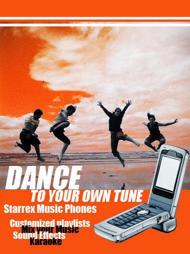
This advertisement above has exemplified a bad use of typography. Apart from the word "dance, I feel that heavy fonts should not be in italics in a small size. It does not look elegant or nice. The spacing between the words "customized playlists", "Mix your Music", "Sound Effects" and "Karaoke" too close. The line height should be increased as it is difficult to read although the effect was intentional.
I cannot tell the key message of this poster as the main word is "dance". I would have thought that this was a poster to promote dance classes instead of one which advertises a phone., if not for the picture of the handphone.To improve this, the words "Starrex Music Phones" should be the highlight. They can also use a different font which is not too contrasting so that it is easier for readers to tell apart the specifications of the phone apart from the heading.


The exposure to mistakes in typography and how it affects readers' or clients' attention has made me realise its importance. I will use this knowledge to work on the typography of my CA2 assignment to ensure that I do not make any mistakes like the examples above.


Sunday, 28 July 2013

Sem 1 Week 13: Introduction to Adobe Indesign

This week, we learnt how to use Adobe Indesign. It was an important lesson because we need to learn how to use this software well before we start on our CA2 which is to design a brochure. The tools are similar to Adobe Illustrator, just that it is more convenient for me to write words.

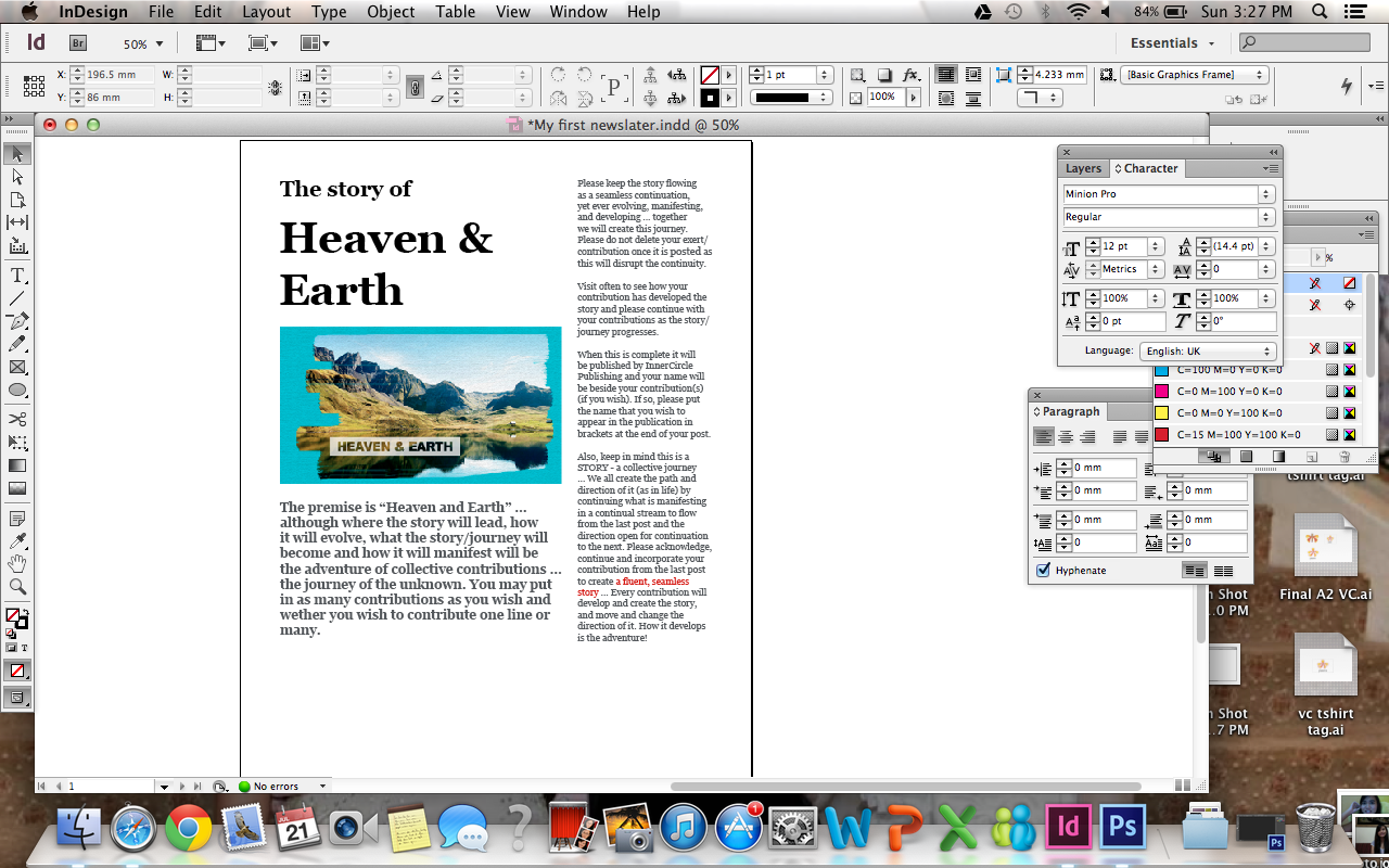
Before using the software, we edited an image on Photoshop first. Below is the result of our first activity. It was supposed to be "Heaven & Earth", but we were free to play around with the tools hence I typed my name instead.


We then proceeded to execute our first brochure, in which the content is ready for us to use. 


The last picture above is the final product of our brochure. The blue lines are the guides for me to check the grids and alignments of the brochure. It can be made invisible and will not appear after printing.

This week's lesson was tough at first because of the editing of the photo. We edited the image on photoshop before opening it in Indesign. However, I could really feel the sense of achievement after completing the brochure at the end of the day although we only followed through the lesson.

The tutorial made me consider a few things to be kept in mind while doing my CA2. I would need to ensure that the font is appropriate, followed by the spacing of the fonts. Lastly, I need to ensure that I deselect the hyphenate bar. I prefer my texts to be non-hyphenated as it will be easier to read.

However, this activity made me realise that it is alright if my brochure is simple, as long as it is neat and the key message of the brochure is brought across. As long as the brochure design is simple and appropriate, it will be fine. This leads me to decide on a simple and neat corporate brochure, instead of one with fancy designs.

Sunday, 21 July 2013

19/07/13: Visual Communication Week 14

This week we were taught to design a brochure. After doing some consultations for our CA assignments, we learned about effective brochure designs that will appeal to clients. Then, we learnt how to use several tools on InDesign software and created a travel brochure using the software mentioned.

1. Effective brochure designs

During the first part of our lesson, we learnt that there are 8 elements of an effective brochure design as stated below.


  • Meets clients' needs
  • Meets branding guidelines
  • Has your "valuable input"
  • Has an attention-grabbing cover using visuals or header
  • Has strong images and graphics
  • Clear and compelling content
  • Unique selling point (UOP)
  • Call to action
For our upcoming CA, I believe that it would be wise to concentrate on the design aspects such as having an attention-grabbing cover and having strong images and graphics. This is because we will be assessed through our design skills and the contents of the brochure have already been given.

The degree as to how presentable and nice a brochure is is subjective. However, there are certain guidelines which ensures that a corporate brochure is within acceptable range in terms of how it looks. For example, I think it is important to keep the brochure design simple and professional. To achieve this, the main theme of the brochure is important as it will influence the colour theme, fonts and pictures used.

An example of a corporate brochure

The image above is an example of my personal favourite corporate brochure. It has a neat and defined layout. The colours red, white and black are the main colour theme, making it look professional. The content does not seem to chunky or wordy as they are separated into smaller paragraphs with pictures in between. This appeals to readers more as it does not look boring. However, I do not like red page where the font is white. This is because there is too much contrast and it might be difficult for readers to read.

The 8 elements shared drove me to consider the theme of my brochure carefully. Now, I am certain that I would like to keep my brochure design simple and neat. Although keeping a design to be simple and neat may sound easy, it is actually difficult as I need to think of a way to make it outstanding despite it being simple. This week's tutorial sure helped me a lot!

2. Designing a travel brochure


I had some difficulties using this software along the way as it was our first time doing a whole brochure on this software. Today, we learnt how to import images to our brochure and to import a newly-added font. Initially, I had some difficulties importing the images at first because I could not fit the entire picture into the frame, hence half of the picture was gone. In the end, I realise there were two separate borders and guidelines for me to follow and that I could click to resize the picture to fit it in the frame. 

This week's lesson was not content-heavy but I learnt a lot while going through the activity for the InDesign software. I realise that there are more things learnt and I got to jot down notes lest I forget what was thought! Initially, I did not jot down notes as I believed whatever has been practiced will not be forgotten. However, Ms Li Sar suggested that we take down notes and I realise how much it meant afterwards when I went home to try the software again!

Sunday, 7 July 2013

Semester 1 Week 12: Introduction to Photoshop 2

This week, we learnt to use more Photoshop tools to edit images; namely the magic wand tool. We also learnt to flip the image, scale, rotate and also adjust its opacity. Creating layers and applying texture were also covered in this lesson.

Firstly, we polished our skills in cutting out an image from its background using the quick selection tool. We also learnt when to use the magic wand tool at the appropriate times, which is when the background of the image has a colour which is starkly different. As seen from the image above, I have cut out the background of the different vegetables before placing them on the chopping board. It was a little more challenging to edit the image of the lettuce as compared to other vegetables because its edges are not smooth curves.


Then, we edited images of fishes and placed them in the fish bowl which was given a solid colour as its content. To make the picture look more realistic, the opacity of the water was decreased. If we compare the two pictures above, the one on the right looks more realistic because the opacity of the water has been decreased.


Lastly, we learned how to layer an image on top of another and used the multiply layer to create an image. For example, the image above was created from layering a picture of a crushed paper on a car. 
I cleaned the edges of the car to delete the parts of the paper off the car to ensure that the image looks realistic.

Out of the three, my favourite is the last image. I never knew that it was possible to layer an image on top of another to create such an effect. It is also not much of a hassle to clean up the sides using the eraser tool to ensure that the image of the crushed paper is not seen off the car. I look forward to discovering other pictures that can be layered on top of others to create many different effects.

Sunday, 30 June 2013

Semester 1 Week 11: Introduction to Photoshop

This week's lesson covered an introduction to Adobe Photoshop. We learnt really simple tools such as using the selection tool and also the shortcuts to edit and resize certain parts of the photo.
Before                                                                                   After             

In the photos above, I have enlarged the lady's eyes. I used the quick selection tool to select her both her eyes, followed by the command button and the T key to select her eyes. Then, I resized her eyes simply by resizing the box. However, to make it as natural as possible, I did not enlarge her eyes too much. 

The image above is an exercise we did during class. We simply used the quick selection tool to select the mask and delete its background. Then, we dragged the image on the lion and resized it to fit the lion perfectly.

While doing these, I realise that it is quite difficult to ensure that the quick selection tool or the magic wand tool only selects the areas that we want due to the similarity in the colours with the background. It took me a few tries before I managed to select only the eyes of the woman without cutting into her face. It was easier to apply the same skills while editing the second picture of the lion with the mask. This is because the black mask was placed against a white background, hence making it easier to select the mask apart from its background and delete the latter.

Prior to this lesson, I knew about the wonders of Photoshop. However, it was after the lesson where I found out that simple tools such as quick selection and resizing the pictures can make a person's picture become much more pleasant to the eyes. Besides its main function for this module which is to use design our work, it is also beneficial when it comes to beautifying one's picture. The picture of the woman I edited above is an example of its magic. With such advancement in technology which is readily made available, anyone and anything can look beautiful in the virtual world.

Photo credits:   from https://blogger.googleusercontent.com/img/b/R29vZ2xl/AVvXsEjhIR-JfXTPetPGtWcwsPWOsSfk9E0R07HLYqcP5FKquoh6nfOqeqe-yQF5A020j4eT_OFwCDH85pkjxhFOKeP0GESoUmOgvElp5keY7oQsb0TDPlQGj3vCntOC5oAUYVjqqddNA0Tmw_Y/s1600/Ga-In.jpg

Sunday, 26 May 2013

Tutorial 6: Introduction to Adobe Illustrator

This week, we learnt how to use Adobe Illustrator and use shapes to draw images. It was tricky at first, and it took me some time before I got used to handling the tools. We were introduced to the basic illustration tools such as the pen tools, type tool, selection and direct selection tools. We learnt to use the gradient tool and scale our drawings on illustrator, as well as using guides to arrange drawings and put them in place. The penguin below is a result of a whole day of sitting in front of the laptop and scaling the drawings.

Original penguin 
Penguin drawn by me

The penguin on the left is the original image while the one on the right is the result of my work. Although the lines and curves are not smooth, this is my first try and I aim to do better with more practices ahead.

During this process, I learnt that it is important for me to plan before I draw. It is always best to break the different part into layers so that I do not delete the parts that I have done by accident. I have also learnt that it is best to be thorough in my tight sketches so that I can scan them in and use them as a guide on Adobe Illustrator (AI) when I execute my designs on the software. However, I also need to use the rulers and guides on AI to ensure that my drawings are scaled and proportionate. I cannot depend on my tight sketches alone as they are only rough guides.

Adobe Illustrator is once I get the hang of it. However, judging from how my penguin drawing turned out, I believe I need to polish my skills more.